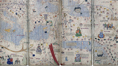
2.0 Unit 2 Overview

  • 2 Videos
  • 4 Articles
  • 7 Activities
  • 3 Visual Aids
  • 2 Vocab Activities

Cookie Policy

Our website uses cookies to understand content and feature usage to drive site improvements over time. To learn more, review our Terms of Use and Privacy Policy.

Introduction

Why pick 1200 as the starting point for a history course? The answer: 1200 has a nice ring to it, don’tcha think? All kidding aside, it’s actually because we want you to have some important historical context for how the world was organized before it became globally connected. Learning about the variety of communities and networks that existed from 1200 to 1450 CE will also allow you to make historical comparisons across time and geographic space. In this lesson, you’ll also start learning how to read and interpret data, a skill that will help you understand how this type of evidence is used to support historical claims.

Learning Objectives

  1. Understand how communities were organized and how these communities interacted through global networks in the thirteenth century.
  2. Learn how to read charts and interpret historical data.
Video

Unit 2 Overview

Vocab Terms:
  • city-state
  • expansion
  • GDP (Gross Domestic Product)
  • network
  • plague
  • Swahili

Summary

In the year 1200 CE, most people lived local lives, and communities differed dramatically from place to place. But from 1200 to 1450 CE, new connections forged larger and larger networks. New connections among societies transformed communities around the world. In Afro-Eurasia, these patterns of growth and interconnection were most prominent, but similar patterns emerged in other parts of the world, like the Americas and Oceania.

Unit 2 Overview Video (10:38)

Key Ideas

As this video progresses, key ideas will be introduced to invoke discussion.

Purpose

This video begins the narrative of this course in 1200 CE. In this era, there was a vast diversity among human communities, though interconnection was generally increasing. This video asks you to consider the impacts of these changes by responding to the Unit 2 Problem: How did networks of exchange connect societies, and how were communities changed by these connections? It also gives you your first evidence for beginning to shape a response to this question.

Process

Preview – Skimming for Gist

Before you watch the video, open and skim the transcript. Additionally, you should always read the questions below before you watch the video (a good habit to use in reading, too!). These pre-viewing strategies will help you know what to look and listen for as you watch the video. If there is time, your teacher may have you watch the video one time without stopping, and then give you time to watch again to pause and find the answers.

Key Ideas – Understanding Content

Think about the following questions as you watch this video:

  1. According to this video, what were the big changes that took place from 1200 to 1450?
  2. What two factors does this video credit with permitting the expansion of networks in this era?
  3. What does the data on global GDP tell us about this era?
  4. How did the expansion of trade to East Africa change the cities of the Swahili Coast?
  5. What is some evidence that the video uses to argue that the Swahili city-states brought together different worlds?
  6. What were some of the consequences of new interconnections and expanded networks?

Evaluating and Corroborating

  1. This video uses global historical GDP as evidence to argue that trade increased during this era. Do you agree with this argument? What are some other kinds of evidence that could be used to show increases or decreases in trade and interconnection?

Article

Unit 2 Overview: The Global Tapestry

Vocab Terms:
  • community
  • concentrated
  • network
  • region
  • society
  • trade route

Preparation

Article
Activity

Summary

For most students, this class starts in the year 1200 CE. Studying the period from 1200 to 1450 CE allows us to see the diversity in global societies and their connections to each other in a period before the big world zones all became connected. In this unit, you will look at the regions of the world beginning in 1200 CE and prepare to study change from that period to the present—changes that helped to create the world we live in today.

Purpose

This overview will introduce you to Unit 2. In particular, it will help you think about the vast diversity of human societies and the ways by which people in different places developed their own strategies and systems for living in the world. It will also reveal how people and societies learned from each other, at least within vast zones of the world.

Process

Preview – Skimming for Gist

Fill out the Skimming for Gist section of the Three Close Reads worksheet as you complete your first close read. As a reminder, this should be a quick process!

Key Ideas – Understanding Content

For this reading, you should be looking for unfamiliar vocabulary words, the major claim and key supporting details, and analysis and evidence. By the end of the second close read, you should be able to answer the following questions:

  1. Why does this course start around 1200 CE?
  2. What three big zones help to structure this unit?
  3. What frame does the author suggest is most useful for comparison within and between these zones?
  4. Why, according to the author, did people want or need goods produced in different regions?
  5. What were some of the consequences of long-distance connections within zones of the world?

Evaluating and Corroborating

For the third close read, you should think about how the article relates to the idea or question you thought about as you read.

At the end of the third close read, respond to the following questions:

  1. Why do you think the author makes such a big deal of the fact that societies in this period were different and diverse, but also that many were connected to each other and shared ideas and technologies?
  2. Think about your own community. How is it different from neighboring communities or other communities you’re familiar with? Are there any connections that link your communities with the others? How do these connections (such as religion, business, or sports) impact your community?

Video

Unit 2 Frames

Summary

The world from 1200-1450, the period covered in this unit, was one of astounding diversity. Most societies were disconnected from people in distant places, so lifestyles, beliefs, and cultures were unique around the globe. But there was also remarkable interconnectedness during this period that set the stage for the rapid global transformations to come. By exploring the 250 years covered in this unit from the communities, networks, and production and distribution frames, this video reveals what the world was like during this period as well as the many ways things changed in this time.

Unit 2 Frames (5:06)

Key Ideas

As this video progresses, key ideas will be introduced to invoke discussion.

Purpose

This video familiarizes you with Unit 2 of this course, which covers the period from 1200-1450. It uses the three course frames to introduce you to the world in this period. While each frame will give you a different idea of what was happening and the way things were changing, together they will help you understand how this world was different from our own and the important changes that took place. As you watch, remember to think about the different story each frame reveals, and what details may be illuminated by considering the way these frames come together.

Process

Preview – Skimming for Gist

Before you watch the video, open and skim the transcript. Additionally, you should always read the questions below before you watch the video (a good habit to use in reading, too!). These pre-viewing strategies will help you know what to look and listen for as you watch the video. If there is time, your teacher may have you watch the video one time without stopping, and then give you time to watch again to pause and find the answers.

Key Ideas – Understanding Content

Think about the following questions as you watch this video:

  1. What, according to this video, did the world generally look like from 1200-1450?
  2. What mighty empire emerged early in this era and what territories did it include?
  3. In what ways did large empires allow for the creation and expansion of long-distance trade routes, and how did these routes transform societies?
  4. In what ways did the network based on the Islamic faith in Afro-Eurasia allow for expansion during this period?
  5. According to the video, there were also consequences to expanded networks. What major event occurred between 1346-1351 and what were the consequences?
  6. What are three important technologies that spread during this period?

Evaluating and Corroborating

  1. The video makes the claim that, in history, nothing happens in a straight line. Using one of the three frames, what types of factors would make change happen in different ways or at different speeds?

Activity

Geography – Unit 2 Mapping Part 1

Preparation

Activity
Visual Aid
Visual Aid
Visual Aid

Purpose

In Unit 2, you will explore the rich diversity and surprising interconnections of the world from 1200 to 1450 CE. Over the course of this unit, you will see new long-distance trade routes emerge and expand, reshaping the communities they passed through. The purpose of this activity is to introduce some of the many communities that you’ll encounter in this unit. You will also begin thinking about how these varied communities were connected to each other and you’ll predict the consequences of these interconnections. The focus of this activity is on the task of identifying and predicting with maps. As the opening map activity for this unit, this is intended to help orient you in time and space while raising some important questions about the geography you’ll encounter in this unit.

Process

You will begin this activity by identifying several communities in the world of 1200 CE. You’ll then locate these communities on a blank map and make some guesses and predictions about the consequences of connectivity from 1200 to 1450.

Step 1

This activity is intended to introduce the geography of the world in 1200 CE. You aren’t expected to have all the answers!

With your teacher, brainstorm some factors that might have impacted the development of long-distance connections in this period. How do you think the development of these connections might have reshaped human communities? Your teacher may add some factors you haven’t thought about.

Step 2

In small groups, you should select one “communities” and one “geographic features” column from the table and label the four units in each of your selected columns on the blank map (eight labels total). When this is complete, each group should share their answers until all 40 features are labeled on your map.

Step 3

Now examine the 1200 Political Map and the Medieval Trade Routes Thematic Map. Choose two communities you just identified and make a guess about how environmental, political, or cultural factors might have shaped connectivity in that place. Finally, annotate your map, making predictions for how and where you think the expansion of long-distance trade will change life for humans over the course of this unit (1200 to 1450 CE).

Activity

Vocab – Tracking 2.0

Preparation

Vocab Activity

Purpose

This repeated activity should help you become familiar with a process for understanding unfamiliar words any time you encounter them in the course.

Process

Take out your vocab tracker and be sure to record new and unfamiliar words on it according to your teacher’s instructions.

Activity

Vocab – Word Wall 2.0

Preparation

Vocab Activity
Activity
Activity

Purpose

Understanding vocabulary is integral to you being able to access course content. This word wall activity will expose you to some of the most important words in Unit 2.

Process

In this activity, you’ll work with your class to create a word wall using the Unit 2 vocabulary.

Your teacher will assign a vocab card to each of you. Once you get yours, take a few minutes to look it up in the Unit 2 Vocab Guide and then examine the unit itself (click around and quickly skim the content) to see where in the unit your word might be most applicable. Once you’ve done your research, create a sentence using your word. And, just like you did in Unit 1, get ready to argue for why your word is the “best” one to start with. After everyone has given a pitch on their word, you’ll all decide which two words should make it onto the wall first.

Your teacher may add some fun twists to this assignment, so be sure to listen closely for directions!

Activity

UP Notebook

Preparation

Activity

Purpose

Each unit of the WHP course is guided by a Unit Problem. You’re learning a ton of stuff in this and every other unit, and it can be hard to keep track of what’s most important. It would be pretty easy to become obsessed with a detail that, although interesting and a great way to impress people at a party is relatively unimportant. This activity will help you stay focused! You’ll think about the Unit Problems, and then you’ll respond to them in writing. By keeping track of how your thinking changes throughout each unit, you’ll see how much you’re learning as you move through each section of the course.

Process

Use the Unit 2 Problem Notebook Worksheet to respond to the prompts as best as you can. Be prepared to talk about your ideas with your class.

Article

Project X – A Guide to Reading Charts

Vocab Terms:
  • axis
  • chart
  • datum
  • graph
  • scale
  • variable

Preparation

Article
Activity

Summary

From ice cream consumption, to climate change, to Nicolas Cage and deadly pools, charts convey some critical information. But they’re not always easy to read. In this guide, Marissa Major introduces you to some common types of charts and provides strategies on how to read them. But remember, people can use charts—and data—to lie. So, it’s always important to evaluate the stories told by the charts you encounter. The future of mint chocolate chip just might depend on it.

Purpose

This guide is the first part of Project X. Project X is a series of articles and activities built into the course that are designed to teach you how to read, evaluate, and use data and charts. This guide introduces some of the basic concepts of different kinds of charts and warns you about some common ways that people use charts to manipulate the truth. Don’t throw away this guide when you’re done reading it—it will be useful later, when you encounter your first Data Exploration. In the next Project X activity, you will learn another Three Close Reads process, specific to Data Explorations, but for this article, you can use the Three Close Reads process you already know so well!

Process

Preview – Skimming for Gist

Fill out the Skimming for Gist section of the Three Close Reads worksheet as you complete your first close read. As a reminder, this should be a quick process!

Key Ideas – Understanding Content

For this reading, you should be looking for unfamiliar vocabulary words, the major claim and key supporting details, and analysis and evidence. By the end of the second close read, you should be able to answer the following questions:

  1. Why is the chart linking violent crime and ice cream sales misleading?
  2. Where are the x-axis and y-axis located on the chart about student knowledge in WHP?
  3. What are variables?
  4. What is scale in charts?
  5. How is the “Average Annual Global Temperature in Fahrenheit” chart misleading?
  6. Are Nicolas Cage films drowning people in pools?

Evaluating and Corroborating

At the end of the third close read, respond to the following question:

  1. Can you think of any examples you’ve seen of someone using data or charts to present misleading information?

Activity

Project X – Three Close Reads for Data – Introduction

Preparation

Activity
Article

Purpose

In this activity, you are introduced to the WHP Three Close Reads for Data tool, which will provide you with a method for unpacking the charts you will encounter in this course and identifying the various elements of data visualizations. Instead of simply accepting data visualizations as truth, you will learn to evaluate the quality of data and the ways that data can be manipulated in charts. This will help you throughout this course, as well as encourage you to be thoughtful and inquisitive when coming across visual representations of data in your everyday life.

Process

The Three Close Reads strategy for articles may already be familiar to you. In order to help you develop your ability to “read” data, the Three Close Reads for Data process is solely focused on the charts and graphs in the data articles.

Project X includes several articles that will introduce you to a series of charts from the Our World in Data website. While the articles provide historical context and an overview of the information contained in the charts, the Three Close Reads for Data tool will guide you through the process of reading, understanding, and evaluating each chart you encounter. Before you begin the Data Explorations, be sure to read the article, “A Guide to Reading Charts.”

Even though charts and maps are graphics—they’re essentially pictures—they still need to be “read” in much the same way you read text. Three Close Reads for Data is a helpful tool for getting all the information you need from the charts. Don’t worry— you’ll get faster and faster with each reading!

Take a look at the Three Close Reads for Data worksheet and quickly review the process for opening and reading the charts linked in the article.

Overall question or idea to think about as you read:

Before you read the article or open the chart, your teacher will give you a question or idea to think about as you read. Write this question or idea in the box provided at the top of the Three Close Reads for Data worksheet. Keep this framing question or idea in mind as you explore the charts.

Reading 1— What do we have?

The first close read is really meant to be a quick scan of the chart to identify its labels, variables, and scale. It should be very quick and allow you to identify what the chart is measuring. You should be looking at the title, labels, and captions. You should determine whether this is an interactive chart, but don’t start playing with any interactive functions just yet. On the Three Close Reads worksheet, look at the “Questions” section for the first close read and see which questions you can answer quickly.

Reading 2 – What do we know?

Now, look at second section of the worksheet. Here, you’re trying to understand the “story” the chart is telling by identifying its arguments and evaluating its presentation of data. Review the “Pay Attention to…” and “Questions” sections of the worksheet so you know what to keep in mind as you start to examine the chart and play with any interactive elements. If the chart is interactive, what elements can you change? Does that change your understanding of the chart’s story?

By the end of the second close read, you should be able to answer the following questions:

  1. How has the global human population changed in the last 12,000 years?
  2. In what 50-year period did the human population increase most dramatically?
  3. Has the global human population ever shrunk? When? What events might have caused this?
  4. What argument is this chart is making? How did the creator of this chart want you to feel after seeing it?
  5. What dates do we seem to have the best data for? Do you think you can trust the population data used in this chart?

Reading 3 – What does this tell us?

Now, it’s time for the third and final read. For this read, focus on why this chart matters, how it can inform us about the past and prepare us for the future. At the end of every Reading 3, you should make a prediction about how the topic covered by the chart will change during your lifetime. How might the global population change in the next 25 years? 50 years? 100 years?

At the end of the third read, discuss the following questions with your class:

  • Why does this chart matter? What do global changes in population tell us about human communities, networks, and production and distribution?
  • Using this chart, make one prediction about how the global human population will change in your lifetime. What evidence from the chart supports your prediction? Is there any evidence that challenges it?

Article

Data Exploration: Population

Vocab Terms:
  • datum
  • demography
  • population

Preparation

Article
Activity

Open “World Population since 10,000 BCE” chart in your internet browser: https://ourworldindata.org/grapher/world-population-since-10000-bce-ourworldindata-series

Summary

Demography is the study of populations. This article and the chart it contains introduce you to what is probably the most important demographic story in history: the dramatic increase in the human population in the last two centuries. The chart measures human populations from 12,000 years ago (10,000 BCE) to today. For most of our history, the human population has grown quite gradually. Then, after about 1800, our numbers began to rise very quickly and reach very high numbers. Today, there are over 7 billion of us on this planet. In 1800, we numbered about 1 billion.

Purpose

This article introduces you to what we call a data exploration. In each data exploration, you’ll be asked to read one or more charts. The ability to read, analyze, and evaluate charts is really important—in this course and beyond. Reading, analyzing, and evaluating charts helps you understand how people are representing history, but it can also help you be a better consumer of media and the news. We constantly see data used to make claims in the world, so it’s important for you to be able to fully understand and analyze data visualizations like this chart so you can come to your own conclusions about that data.

Process

Your teacher will let you know if there is an overall question to hold in your mind as complete your three reads of the article.

Preview – What Do We Have?

Fill out the Read 1: Preview section of the Three Close Reads for Data worksheet as you complete your first close read. Remember—this should be a quick process!

Key Ideas – What Do We Know?

For this read, your goal is to understand the “story” the chart is telling by identifying its arguments and evaluating its presentation of data. You will decide what claim or claims this chart is making and what evidence is being used to support those claims. Do you think the data is reliable? Is the chart misleading in any way? By the end of this read, you should be able to answer the following questions:

  1. How has the global human population changed in the last 12,000 years?
  2. In what 50-year period did the human population increase most dramatically?
  3. Has the global human population ever shrunk? When? What events might have caused this?
  4. What argument is this chart is making? How did the creator of this chart want you to feel after seeing it?
  5. What dates do we seem to have the best data for? Do you think you can trust the population data used in this chart? Why or why not?

Making Connections – What Does This Tell Us?

The third read is really about why the chart is important, what it can tell us about the past, and how it can help us think about the future. At the end of this read, respond to the following questions:

  1. Why does this chart matter? What do global changes in population tell us about changes in human societies? How has population growth affected the way we organize ourselves, communicate with each other, and make and use goods?
  2. Using this chart, make one prediction about how the global human population will change in your lifetime. What evidence from the chart supports your prediction? Is there any evidence that challenges it?