4.0 Era 4 Overview
-
 2 Videos
-
 2 Articles
-
 8 Activities
-
 2 Visual Aids
-
 2 Vocab Activities
On this page
Skip On Page LinksUpdate ahead! This course will be updated soon. See what's changing.
Introduction
This era reminds us that stories do not always move in the direction we expect them to. The nature of history is irregular and unpredictable, looking less like a straight-flying crow and more like a hummingbird darting from one flower to another. Regional webs, or networks, started showing humans how far humanity could go, without really clarifying what the limits were. Exploring continuity and change over time will be essential as we think about this era’s darting pathways from prosperity to collapse to reconstruction. Using comparison and causation skills, our understanding from Era 3 will help us contextualize Era 4.
Learning Objectives
- Understand how historians create narratives to explain how societies rise and fall.
- Evaluate and analyze the historical narrative of the rise and fall of societies.
- Learn how to read charts and interpret historical data.
- Use the historical thinking practice of continuity and change over time to evaluate how communities and networks expanded and contracted in this era.
Era 4 Overview
Vocab Terms:
- catastrophe
- chieftain
- dynasty
- kingdom
- network
Summary
Early in Era 4, the two pillars of the Eurasian trading network, the Roman Empire and Han Dynasty China, collapsed. These weren’t the only societies to go into decline or break down during this era. As a result, European historians in particular have labelled much of this era a “dark age”. But was this true everywhere, or anywhere? Looking at Era 4 on a global scale, we see restructuring and rebuilding, often in the aftermath of crisis, both in the Americas and in Afro-Eurasia.
Era 4 Overview Video (9:04)
Key Ideas
Purpose
This video introduces you to the global history of humans and our societies during Era 4. It focuses on a question that becomes particularly clear in this period: What happens when communities and networks go into crisis or break down? Through this video, you will think about that question and encounter the first evidence you can use to respond to it.
Process
Preview – Skimming for Gist
As a reminder, open and skim the transcript, and read the questions before you want the video.
Key Ideas – Understanding Content
Think about the following questions as you watch this video:
- What does this video say happened to the Eurasian system early in this era?
- What kind of quantitative evidence does the video present that suggests decline in the Roman Empire during this era?
- What evidence from Tintagel points to a dark age in this community? What evidence suggests there was a recovery?
- What evidence does the video present that suggests there was not a dark age across Eurasia during this period?
- How does the video characterize the period after a large-scale collapse?
Evaluating and Corroborating
- How can studying what happens after collapse in history help us today?
- What kinds of evidence would you need to investigate what happened after Han Dynasty China collapsed?
Era 4 Overview: Collapse and Restructuring
Vocab Terms:
- collapse
- narrative
- reorganization
- restructure
- trade network
Preparation


Summary
In the last era, we saw large states and empires emerge, along with the networks that connected them to each other and to surrounding peoples. In this era, we learn that both states and networks can collapse—and frequently did! Collapse could occur for many reasons. It could be brief and insignificant, or it could dramatically change people’s lives for a long time. When recovery happened, the new communities and networks often looked quite different. So, recovery could also involve restructuring.
Purpose
This overview introduces you to two key ideas you should become familiar with in order to respond to the era problem. First, it will show you the ways in which societies and networks could break down. Then, it will give you a sense of the ways in which they recovered, often in quite different shapes than before. Studying these changes will also help you evaluate all three of the frame narratives as they apply to this period. In particular, it will help you to ask whether production and distribution, networks, and communities always grow larger and more complex over time.
Process
Preview – Skimming for Gist
Fill out the Skimming for Gist section of the Three Close Reads Worksheet as you complete your first close read. As a reminder, this should be a quick process!
Key Ideas – Understanding Content
For this reading, you should be looking for unfamiliar vocabulary words, the major claim and key supporting details, and analysis and evidence. By the end of the second close read, you should be able to answer the following questions:
- The article mentions that some people describe what comes after collapse as recovery, but others believe reorganization comes after collapse. What’s the difference?
- What are two different, extreme ways in which historians have sometimes used the term collapse?
- How does the author describe the histories of Africa and the Americas in this period?
- What was the strong center that helped growth resume in Afro-Eurasia in the seventh century?
- In general, what role did religion play in the reorganization of the Afro-Eurasian system in this period, according to the article?
Evaluating and Corroborating
At the end of the third close read, respond to the following questions:
- If we just look at the Paleolithic Era to today, we see bigger communities, more complex networks, and more production and distribution. But the author of this articles suggests that change in these three frames isn’t always happening in that direction. Do you agree with the author? What kind of evidence would support their argument?
- What evidence in this article suggests that Europe recovered quickly after the collapse of the Roman Empire? What evidence suggests a slow recovery? Which do you find more convincing?
Frames in Era 4
Vocab Terms:
- collapse
- distribution
- network
- production
Summary
Era 4 gives us an opportunity to re-examine all of our assumptions about history through each of the three frames. Until this period, it largely looked like change happened in human history in one direction—always bigger, more extensive, and more complex. Examining examples of collapse helps us to question these assumptions. But we also need to question what collapse really means through each of the three frames to get an accurate picture of the past.
Frames in Era 4 (3:16)
Key Ideas
Purpose
The purpose of this video is to help you to filter the big transformations of collapse, recovery, and restructuring through the three frames of the course. This should lead you to support, extend, or contest the long narratives of human history as viewed through these three frames.
Process
Preview – Skimming for Gist
As a reminder, open and skim the transcript, and read the questions before you watch the video.
Key Ideas – Understanding Content
Think about the following questions as you watch this video:
- According to the video, what is the typical view of human history through the three frames?
- What changes happened after collapse, according to the video, through each of the three frames?
- What is significant about Ireland and the Islamic world? What are they examples of?
- What is the purpose of investigating both decline and recovery in the context of the three frames?
Evaluating and Corroborating
- This video mentions places where recovery happened quickly and others where recovery was slow. Using one of the three frames, what types of factors would make recovery faster or slower?
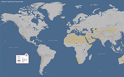
Geography – Era 4 Mapping Part 1
Preparation

Purpose
In Era 4, you will encounter a lot of trade routes, as they expand, collapse, and rebuild along with the societies they connected. Over the course of this era, you’ll see the disruption of old routes, and you’ll see new long-distance trade routes emerge and expand, reshaping the communities they passed through. The purpose of this activity is to introduce you to some of the many geographic features that shaped these routes and impacted the people moving across them. The focus of this activity is on the task of identifying and predicting with maps. As the opening map activity for this unit, this is intended to help orient you in time and space while raising some important questions about the geography they will encounter in this unit.
Process
You will begin this activity by identifying several geographic features that were important to long-distance trade in Era 4. Next, you’ll use a map of medieval trade routes to make some guesses about how these features helped shape long-distance trade during this era of the course.
Step 1
This activity is intended to introduce the geography of the world in Era 4. You aren’t expected to have all the answers!
With your teacher, brainstorm some factors that might have impacted the development of long-distance connections in this period. How do you think the development of these connections might have reshaped human communities? Your teacher may add some factors you haven’t thought about.
Step 2
In small groups you should select one “geographic features” column from the table and label the four units in each of your selected columns on the blank map. When this is complete, each group should share their answers until all 20 features are labeled on your maps.
Step 3
Now examine the Medieval Trade Routes Thematic Map. Choose three of the geographic features you just identified and make a guess about how you think each feature shaped long-distance trade routes in this era of the course. Finally, on your blank maps, trace one trade route that you think will be the most significant during this era.
EP Notebook
Preparation
Purpose
Each unit of the WHP course is guided by an Era Problem. You’re learning a ton of stuff in this and every other era, and it can be hard to keep track of what’s most important. It would be pretty easy to become obsessed with a detail that, although interesting and a great way to impress people at a party, is relatively unimportant. This activity will help you stay focused! You’ll think about the Era Problems, and then you’ll respond to questions about them in writing. By keeping track of how your thinking changes throughout each era, you’ll see how much you’re learning as you move through each section of the course.
Process
Use the Era 4 Problem Notebook Worksheet to respond to the prompts as best as you can. Be prepared to talk about your ideas with your class.
Vocab – Tracking 4.0
Preparation


Purpose
This repeated activity should help you become familiar with a process for understanding unfamiliar words anytime you encounter them in the course.
Process
Take out your vocab tracker and be sure to record new and unfamiliar words on it according to your teacher’s instructions.
Vocab – Word Wall 4.0
Preparation
Purpose
Understanding vocabulary helps you access course content, become a better reader, and a better communicator. This word wall activity will help you begin to learn some of the key vocabulary from Era 4.
Process
In this activity, you’ll work with your class to create a word wall using the Era 4 vocabulary.
Your teacher will assign a vocab card to each of you. Once you get yours, take a few minutes to look it up in the Era 4 Vocab Guide and then examine the era itself (click around and quickly skim the content) to see where in the era your word might be most applicable. Then, add as many antonyms to your card for your word as possible. Your teacher will give you a limited amount of time to write antonyms. Then, the people with the most correct antonyms will put their words on the word wall first.
Your teacher may add some fun twists to this assignment, so be sure to listen closely for directions!
Project X – Making a Prediction Part 2
Preparation
Access to the Our World in Data website: https://ourworldindata.org/
Post-it Notes (four colors)
Purpose
In the first Making a Prediction activity, you learned about chart shapes and practiced making and evaluating predictions using a single chart. However, a single piece of evidence is rarely enough to come to an informed conclusion about a topic. This activity will help you learn to make informed predictions using multiple sources of evidence. You will use this skill not only in your final presentation, but also in your life as you navigate decision-making with an ever increasing number of resources at your fingertips.
Process
This activity begins with analyzing a chart with your class. You will then make a prediction about the future of population growth in China, revising your prediction as you are introduced to additional charts. In the final part of this activity, you will repeat this process with a different country.
Step 1
Take a look at the social media platforms chart, (on pg. S-3). Describe what the chart shows and what it tells you about how social media has changed in the last five years. Then, make and share predictions about what social media will look like five years in the future. Be sure to provide evidence from the chart as well as from your own experience with and knowledge of social media. Remember to include the components of a prediction, which you learned in Part 1 of this activity. A prediction includes a reference to a specific year or time frame, a description of the rate and direction of change, the catalyst (or reason for the change), and the end point for the prediction—either an actual number or a percentage.
Step 2
Now it’s time for you to predict whether population in China will go up, go down, or stay the same in the future. Your teacher will mark a scale on the board from 0 to 5 billion people at half-billion increments and organize you in small groups. You will receive four sticky notes, each of a different color. You should use a different color sticky note for your group’s prediction on each chart. Write your names (or a group name) on your four sticky notes.
Take a look at the chart on Chart A (population growth in China), in the Making a Prediction Part 2: Examining China Through Charts handout. Work with your group to complete the table starting on pg. S-4. Use the information to make a prediction how China’s population will change 100 years in the future based on Chart A and any previous knowledge you may have. Show your prediction to the class by placing your next sticky note on the scale from 0 to 5 billion. Be ready to share your prediction.
Now, look at the chart on Chart B (daily supply of calories in China). Work with your group to complete the table. Repeat this same activity with your group based on the new information you have gathered from Chart B. Do this by simply adding your next sticky note to the board. Maybe your prediction will change or maybe not! Be prepared to explain your prediction to the class.
Repeat this same activity two more times using the charts on Chart C (birth rates) and Chart D (extreme poverty), revising your prediction and adding two more sticky notes to the board as you receive new information.
Great! Now let’s put all this information together to finalize your prediction about the future population of China. Write your prediction for the future population of China. Make sure that your prediction includes a time frame (years/date), reasons for the change, an actual population number, and references to the different charts.
Step 3
Next, your teacher will assign your group a country, or have you choose your own. Your teacher might hand out printouts of the same four charts above for your new country, or have you open the interactive charts on computers. If you are viewing the charts on the computer, you will need to click “Add country” on the chart and replace China with your country. You can find links here:
Chart A: https://ourworldindata.org/grapher/population?country=~CHN
Chart B: https://ourworldindata.org/grapher/food-supply-kcal?tab=chart&country=~CHN
Chart C: https://ourworldindata.org/grapher/children-per-woman-un?tab=chart&time=1950..2015&country=~CHN
Chart D: https://ourworldindata.org/grapher/share-of-the-population-living-in-extreme-poverty?tab=chart&country=~CHN
Repeat the same process you used for China with your new country. Look at the same four charts for your new country, making a prediction for what that country’s population will be in 100 years. Do you think the population will go up, down, or stay the same? Adjust your predictions as you come across new evidence. Record the evidence on your worksheet.
Be ready to share and explain your predictions with the class!
Amazing! Now let’s put all this information together to finalize your prediction about the future population of your new country. Write your prediction for the future population of your new country. Make sure that your prediction includes a time frame (years/date), a description of the trend, reasons for the change, an actual population number, and references to the different charts.
Data Exploration: War and Peace
Preparation
Open the following non-interactive charts in your internet browser:
- Chart 1 – Great Power War: https://ourworldindata.org/uploads/2013/08/ourworldindata_percentage-of-years-in-which-the-great-powers-fought-one-another-1500%E2%80%932000.png
- Chart 2 – Global Deaths in Conflict: https://slides.ourworldindata.org/war-and-violence/#/6
- Chart 3 – Population Control, Marauder Style: https://ourworldindata.org/uploads/2013/08/The-100-Worst-Atrocities-over-the-last-Millennia-New-York-Times-Data-from-Matthew-White0.png
Summary
The past was not peaceful. Human history is filled with violent conflict. But some people think that the world has gotten more violent in the recent past. The world wars of the twentieth century loom large in our memory today. But wars aren’t new, and some even argue that war has been getting less common and less deadly. The three charts in this article offer three different takes on this debate.
Purpose
Data can be used in many ways, and not all charts tell the same story, even when they cover the same topic. In this third data exploration, we introduce three charts about war and conflict throughout human history. All three charts might cover this topic, but each of them tells a different story, and you might draw different conclusions from each. Which do you agree with? Which do you trust the most? How do you tell the difference? This data exploration will help you learn to compare and perhaps combine data from diverse charts to draw your own conclusions.
Process
Your teacher will let you know if there is an overall question to hold in your mind as complete your three reads of the article.
Preview – What Do We Have?
Fill out the Read 1: Preview section of the Three Close Reads for Data worksheet as you complete your first close read. Remember—this should be a quick process!
Key Ideas – What Do We Know?
For this read, your goal is to understand the “story” the chart is telling by identifying its arguments and evaluating its presentation of data. You will decide what claim or claims this chart is making and what evidence is being used to support those claims. Do you think the data is reliable? Is the chart misleading in any way? By the end of this read, you should be able to answer the following questions:
- How are Charts 1 and 2 different? How are they similar?
- What does Chart 1 tell us about war in the last 500 years? Do you think measuring war between the great powers is a good way to understand war in general?
- What does Chart 2 tell us about how the deadliness of conflict changed during the twentieth century?
- According to Chart 3, what was the deadliest event in human history?
- Charts 1 and 2 suggest that the frequency and deadliness of conflict might be declining, especially during the twentieth century. Why does Chart 3 show so many more conflicts in recent centuries than earlier in history?
Making Connections – What Does This Tell Us?
The third read is really about why the chart is important, what it can tell us about the past, and how it can help us think about the future. At the end of this read, respond to the following questions:
- These four charts use similar data to tell slightly different stories. Which do you trust the most to tell us something important about deadly conflict? Why?
- Using these three charts, make one prediction about the future of warfare and deadly conflict in your lifetime. What evidence from the charts supports your prediction? What evidence challenges it?